Progress continues on Beyond the Chiron Gate! This month I’ve made some changes to the game systems and a lot of changes to the UI.
When I started development I let Chiron Gate use SugarCube’s default stylesheet (white on black with #8af blue for links). I added new styles as I needed them, but I always intended to rethink the whole style and colour palette closer to release, and that’s what I’ve been doing this month. I’m generally going for a more muted colour scheme, with with boxes used to distinguish notifications from the rest of the text, and with pops of colour used to highlight only the most important ones.
Here are some screenshots of Chiron Gate‘s new look. You might want to compare them to the screenshots in the June dev blog.
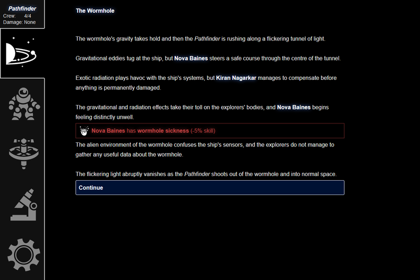
Highlighted text is no longer orange. Instead it’s bright white (the rest of the text has been darkened to light grey), bold, and with a subtle glow effect. It stands out, but it no longer overpowers the rest of the text or looks like something you might be able to click on, which I think was a problem with the old look.
(Have I mentioned that I love the way you can use CSS to add a glow effect to things? I kind of want to add it to everything.)
Notifications appear in boxes: red and gold for especially bad and good ones, and plain white for others. Crew traits now have icons, and the notification also shows the skill modifier that goes with that trait.
Links are now bold white text in dark blue boxes with rounded corners. (They glow when you mouse over them, obviously.) Links are always in these rounded boxes, and rounded boxes always mean links.
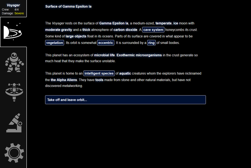
Hopefully it should now be clear on planet view what you can click on and what you can’t.
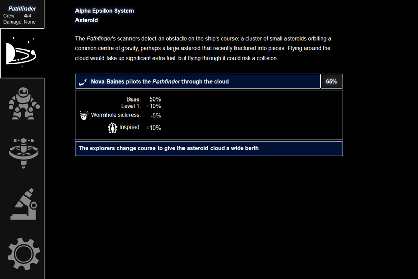
I’ve rewritten the code that displays an option with a variable chance of success. You can now click on the percentage to show a box telling you how it was calculated.
The crew view also shows each crew member’s traits in a clearer way, including the total skill bonus they add up to. Their skill is the number that will be added to the success chance of anything that that crew member does.
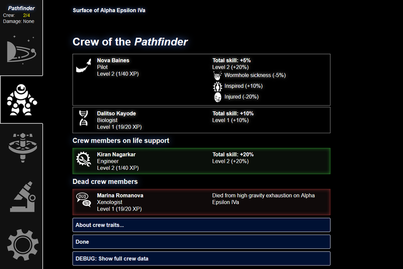
Also, crew members who died on this mission now continue to appear in the crew view, rather than vanishing as previously.
The ship view now shows the currently installed upgrades and any damage the ship has taken.
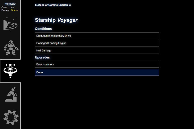
This ship view also shows a new I’ve added this month. Rather than losing Armour, the ship now gains damage traits, which impose penalties to certain checks. A damaged landing engine, for example, will impose a hefty -40% penalty to checks related to landing the ship in difficult conditions. If the ship takes more damage after acquiring four damage traits, it explodes and the game is over.
I might add icons for the ship traits, if I can find good ones.
The big mechanical change this month is that I’ve removed the fuel and armour mechanics entirely and replaced them with these new traits. (Some event text still refers to fuel, but I’ll fix that next month.) I decided that tracking numeric resources didn’t fit in with the mood of the game and wasn’t fun. Losing fuel or armour didn’t really change anything, until you noticed one was low and had to head back home, which was annoying. Your important resources are really your crew members, and the amount of damage your ship has taken, so the place in the top left where the fuel and armour gauges were now displays summaries of those. (In keeping with the new muted colour scheme, it now shows them in white until they start to get into dangerous levels, when they become yellow and then red.)
Like the crew and ship views, the data view also displays things in boxes.
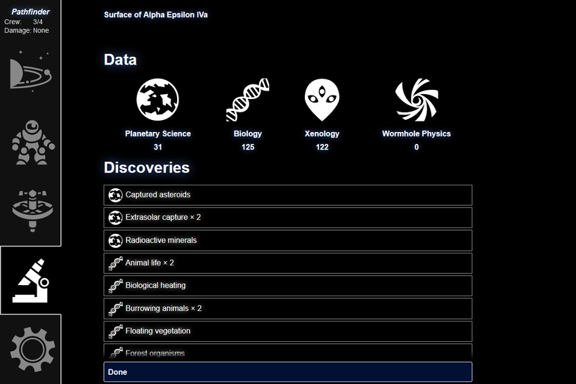
Data types now have their own icons, which distinguish the different discovery types from one another. Back at Chiron Base, the new shipyard interface uses these data type icons to tell you the cost of different upgrades.
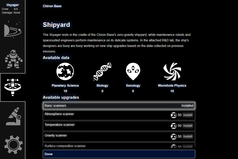
That Done button at the bottom now sticks to the bottom of the screen as you scroll.
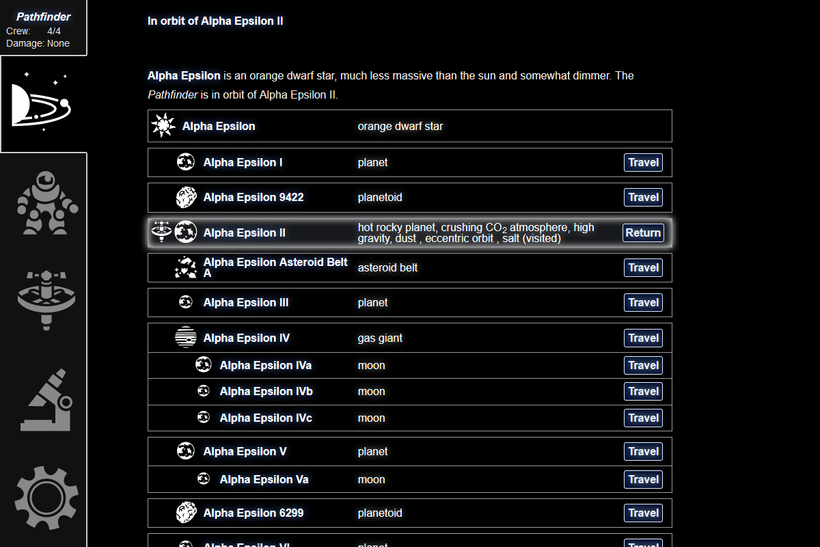
Finally, I’m currently in the process of improving the system view. Planets appear in nice horizontal boxes with the one you’re orbiting highlighted with a glow effect. The text-based list of known planet traits is still ugly, though, so I’m working on fixing that. I might add icons for some planet traits, and/or hide the full known traits of a planet behind a “details” button on this screen to keep the screen less cluttered.
All the icons I’m using are from the excellent game-icons.net.
That’s it for this month. As well as continuing to tweak the interface, my plan next month is to work on the existing events to make sure they’re all consistent with the new mechanics (no mention of fuel and armour, for example), and add some more to round things out.
Thank you all once again for your patience and continued support! See you next month.
