
I’ve levelled up my CSS skills since writing Seedship, so after finishing Rage Quest I decided to use some time between projects to go back and improve my first game’s formatting. I’ve just launched the updated version.
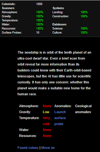
Before:
After:
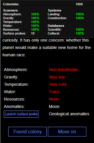
Previously, on small screens, the status display moved to the top and the text shrank, but otherwise nothing changed. Now, the text is larger and the margins are more sensible, the planet display table layout changes to more easily fit everything on, and the text links become buttons to make them more easily clickable on a touchscreen.
Rage Quest was designed with mobile in mind from the start, as will be all my future games.